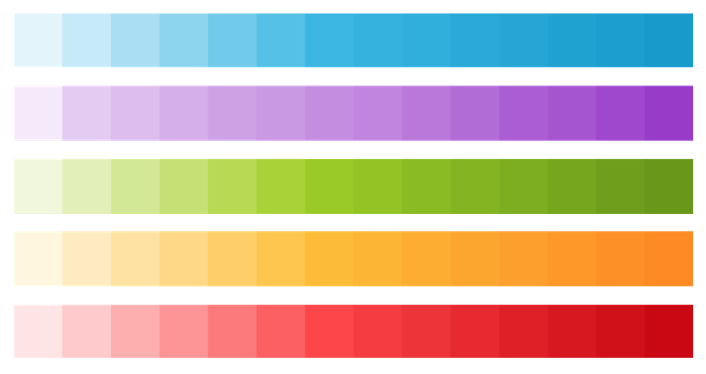
Holo's color palette is opinionated, but limited. Five hues each in a primary and darker shade for a total of ten colors. (There's swatches for lighter tints, but these are rarely used.)

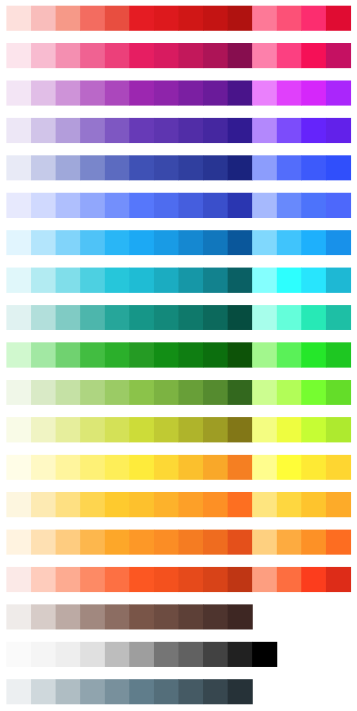
Material Design's color palette is the opposite: 19 hues, 16 of which have accent variants. With all tints including white and black, the palette is a neat 256 colors. With so many colors, Material Design is not a uniform, but a system. You might have six blue apps, with each one in a different shade of blue. The apps that use the system will be vibrant and colorful.

Both of my own apps (Shush & Rounds) use Holo's palette for a native look on Android 4.0. I didn't worry about colors: I just let the platform pick for me. Even Rounds’ icon uses the five Holo colors.
With Material Design in Android 5.0 (“The L Release”), I'm back in the driver’s seat. I'm okay with that. Though it might mean I'll need to redraw Rounds’ icon!