All the Vista Search Fields
For the
Glazed Lists project I'm thinking about developing a Swing search field that looks like the standard one on Windows Vista. I gathered some screenshots from
Long Zheng's blog, which leads me to believe there isn't a 'standard' search field on Vista...
# posted by Jesse Wilson
on Sunday, September 24, 2006
0 comments
post a comment
ListEvent & the deleted element
I'm working on making the deleted element available in every ListEvent. The difficult part is providing that value when the EventList is describing its change to its listeners via our
ListEventAssembler API.
The
ListEventAssembler and
ListEvent provide a lot of functionality that developers don't even have to think about:
- When describing a change you can mark elements as deleted in any order you like. But the recipient EventList always receives its events in increasing order. This is useful for classes like SortedList which naturally scrambles the order of its input events.
- When describing a change, you can mark an element as inserted, and then later mark that same element as deleted. ListEventAssembler will reduce this to a no-op. This is useful for RangeList, which internally handles the changes before readjusting its range offset.
Providing the deleted element led to some interesting code today. Suppose we receive the following change notifications:
updates.beginEvent();
updates.elementUpdated(5, "alpha");
updates.elementRemoved(5, "beta");
updates.commitEvent();
The
elementUpdated() call means that the value at index 5 used to be 'alpha' and now it's something new. The
elementRemoved() call means that the value at index 5 has now been deleted, and it's initial value was "beta".
In this case
ListEventAssembler merges these two calls:
updates.beginEvent();
updates.elementRemoved(5, "alpha");
updates.commitEvent();
The 'alpha' stands because it happened first, but the 'remove' stands because it happened last. It's counterintuitive, but it is exactly what the
ListEventListener expects!
# posted by Jesse Wilson
on Saturday, September 23, 2006
0 comments
post a comment
The Vista UI Guidelines
I just browsed through the
Vista UI Guidelines. As far as I know, the Windows Vista release is all about making Windows fun to use, and the UI guidelines provide the rules of the game. But I think they missed this critical opportunity to fix some things...
Label buttons like Save, not Yes
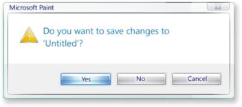
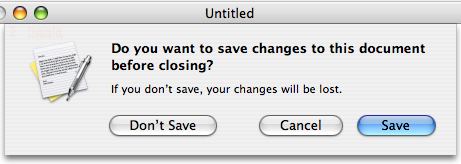
I really like buttons with actions as their captions. It reduces the amount of time necessary to decipher what the dialog is asking me. With 'yes/no' dialogs, I need to read the question, consult my intention, come up with a yes/no answer, then click that button. With 'save/don't save' dialogs, I just match my intention to a button. Vista only pays lip service to action buttons. For example, their highly recommended
standard system dialogs don't even do it:


Modal dialogs vs. Palettes
Picking a color or font on Vista is done via a modal color chooser dialog. On the Mac, I can open a non-modal palette for colors, which means I don't have to constantly be opening and closing the chooser. Suppose I want to use a different colors for each speaker in a conversation:
On Vista, I select the text of the first speaker, click the color picker icon (or menu item!), click blue, then click "OK". I repeat this 4 click operation once for every statement.
On the Mac, I click the color palette icon (or menu item!). Then for each speaker, I select the text, then click their color. So there's a 1 click set-up, opening the palette, and then 2 clicks per statement. Optionally I can spend a final click closing the color palette if I'm done with it.
Expando button
This is an awesome name for the little Advanced >> button on some dialogs. From the guidelines:
"Consider cleaning up your dialog by using a More Options "expando" button, so advanced or rarely used options remain hidden by default."
Vista may be damn sexy but I still think OS X gets both the look and the feel right.
# posted by Jesse Wilson
on Saturday, September 23, 2006
0 comments
post a comment
JXTable multiple column sorting
Tonight I fixed Glazed Lists
Issue 365 by adding multiple-column sorting support for JXTable. The new code works just fine but I think users will still be better off with the
TableComparatorChooser approach for a handful of reasons:
it's more programmable
the right icons for each look and feel
multiple comparators for a single column (like iTunes 7's Album column!)
easy sorting state persistence using Strings
more flexible behaviour, with multiple column sorting done via mouse-only or mouse-and-keyboard
Swinglabs is a big-name Swing project and it'll do Glazed Lists users well to have tight bindings for that project.
# posted by Jesse Wilson
on Tuesday, September 19, 2006
1 comments
post a comment
Swing Tutorial demo requires Java 6!
Since I'm working on new TreeList support for Glazed Lists, I decided to go through Sun's fantastic Swing Tutorial. Although it's a really useful resource, it is still really rough around the edges. For example, instead of a Mac screenshot, there's the text
[PENDING: Mac pic goes here]. Engineering teams are in short supply, so this type of stuff doesn't bother me.
But what's surprising is that the demo requires Java 6! Regrettably I don't have the new Mustang beta on my Mac, mostly because I need something stable for development. I can't imagine that I'm the only one with this problem.
I guess they're probably showing off some of the new APIs in the tutorial. Perhaps it would have been better to provide different versions of the tutorial for different versions of Java?
# posted by Jesse Wilson
on Sunday, September 17, 2006
1 comments
post a comment


