The Vista UI Guidelines
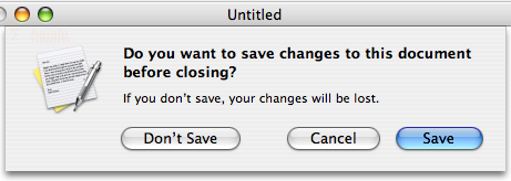
I just browsed through the Vista UI Guidelines. As far as I know, the Windows Vista release is all about making Windows fun to use, and the UI guidelines provide the rules of the game. But I think they missed this critical opportunity to fix some things...Label buttons like Save, not Yes
I really like buttons with actions as their captions. It reduces the amount of time necessary to decipher what the dialog is asking me. With 'yes/no' dialogs, I need to read the question, consult my intention, come up with a yes/no answer, then click that button. With 'save/don't save' dialogs, I just match my intention to a button. Vista only pays lip service to action buttons. For example, their highly recommended standard system dialogs don't even do it: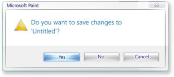
Modal dialogs vs. Palettes
Picking a color or font on Vista is done via a modal color chooser dialog. On the Mac, I can open a non-modal palette for colors, which means I don't have to constantly be opening and closing the chooser. Suppose I want to use a different colors for each speaker in a conversation:Expando button
This is an awesome name for the littleAdvanced >> button on some dialogs. From the guidelines:"Consider cleaning up your dialog by using a More Options "expando" button, so advanced or rarely used options remain hidden by default."
Vista may be damn sexy but I still think OS X gets both the look and the feel right.