I presented Nerding Out on Okio at Android Worldwide last month. After sharing the video link and slide deck, Andrew Kelly tweeted asking if I’d share my process. I’m flattered by the question! So here I’ll indulge and share what works for me.
The gist of my process is to spend an unreasonable amount of time on slides. From Jake’s The Conference Speaker Investment,
The quality of a presentation and of the conference itself can be measured in the amount of investment made.
I spend 30-60 hours building my conference slide decks. I present each deck exactly once with a recording, and perhaps also a Square-internal repeat.
Source Code
My presentations are heavy on source code. This is difficult to do well and I often show too much.
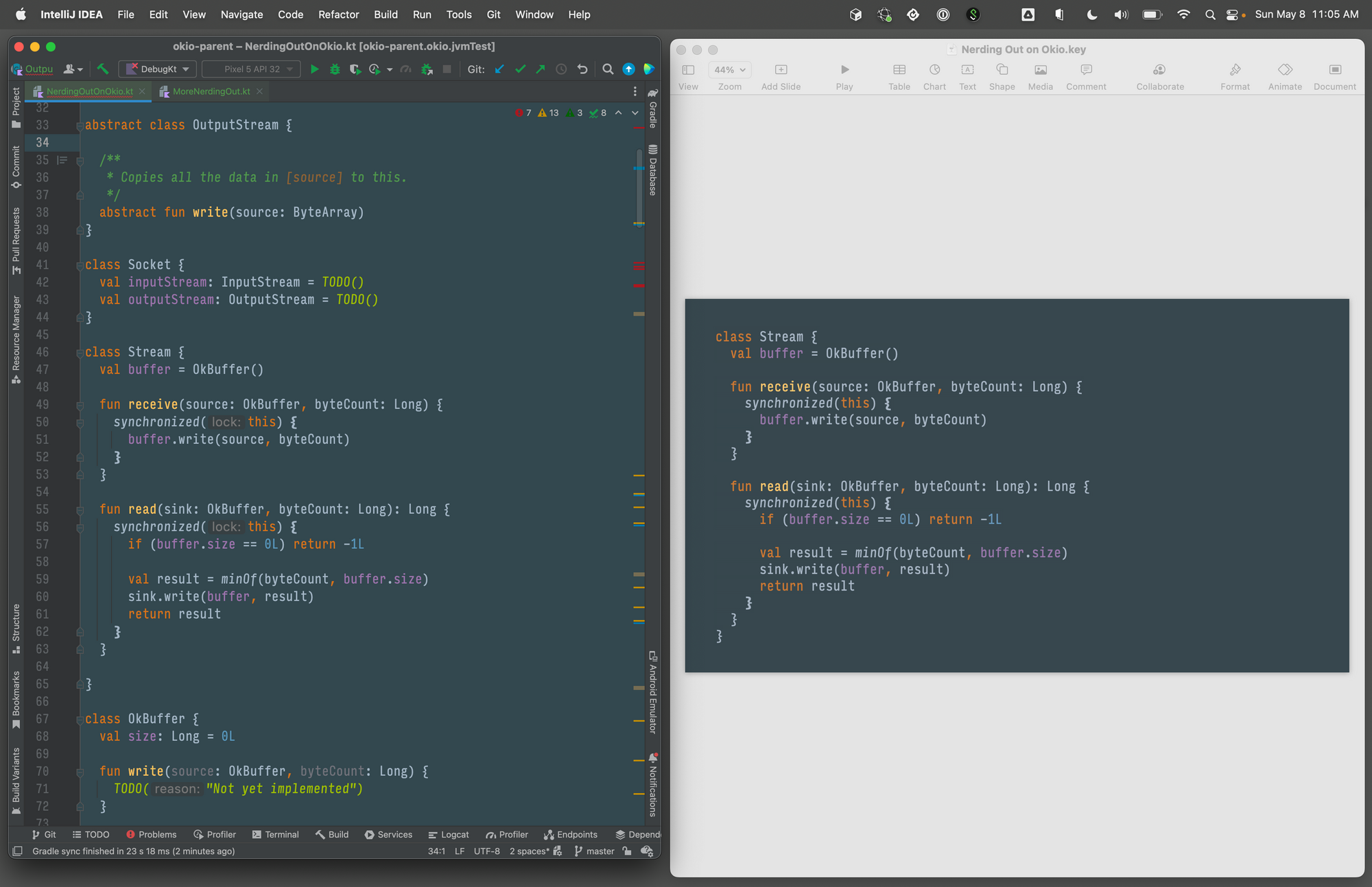
In my decks all code starts in IntelliJ with a lightly-customized Darcula theme. This way I get syntax highlighting when I paste into Keynote. Writing code in an IDE also prevents bugs!
In the Nerding Out talk I wrote new code for all six Buffer implementations! Writing all this code was probably more useful as research to me than as information for the audience.
Data Structures
I aught to use tools like 3Blue1Brown’s Manim, but instead I just brute force it in Keynote. I have to carefully plan each animation out before I burn it into builds and transitions! There’s no automatic fixes here, so if I need to a size later it’ll be extremely labour-intensive.
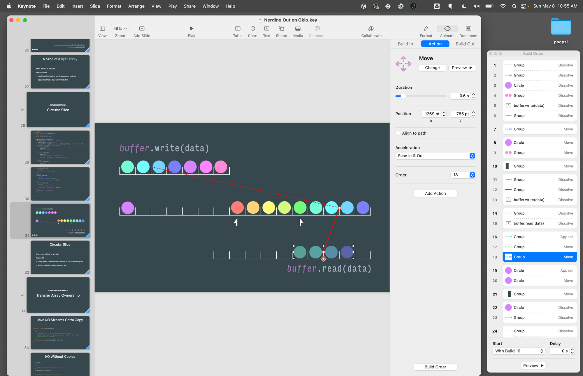
Using explicit item-by-item builds is a lot of work but predictable. I used this for some of the examples in Nerding Out. The slide above has 30 different build steps.
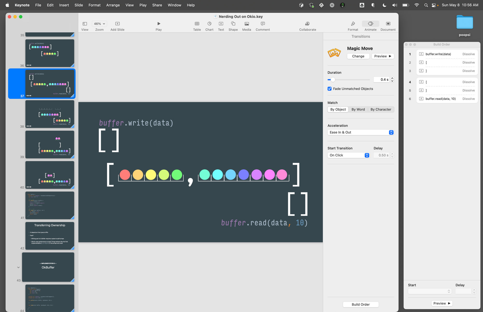
I also like Magic Move though it’s clumsy at tracking object identity across slides. The example above uses 23 builds split across 5 slides.
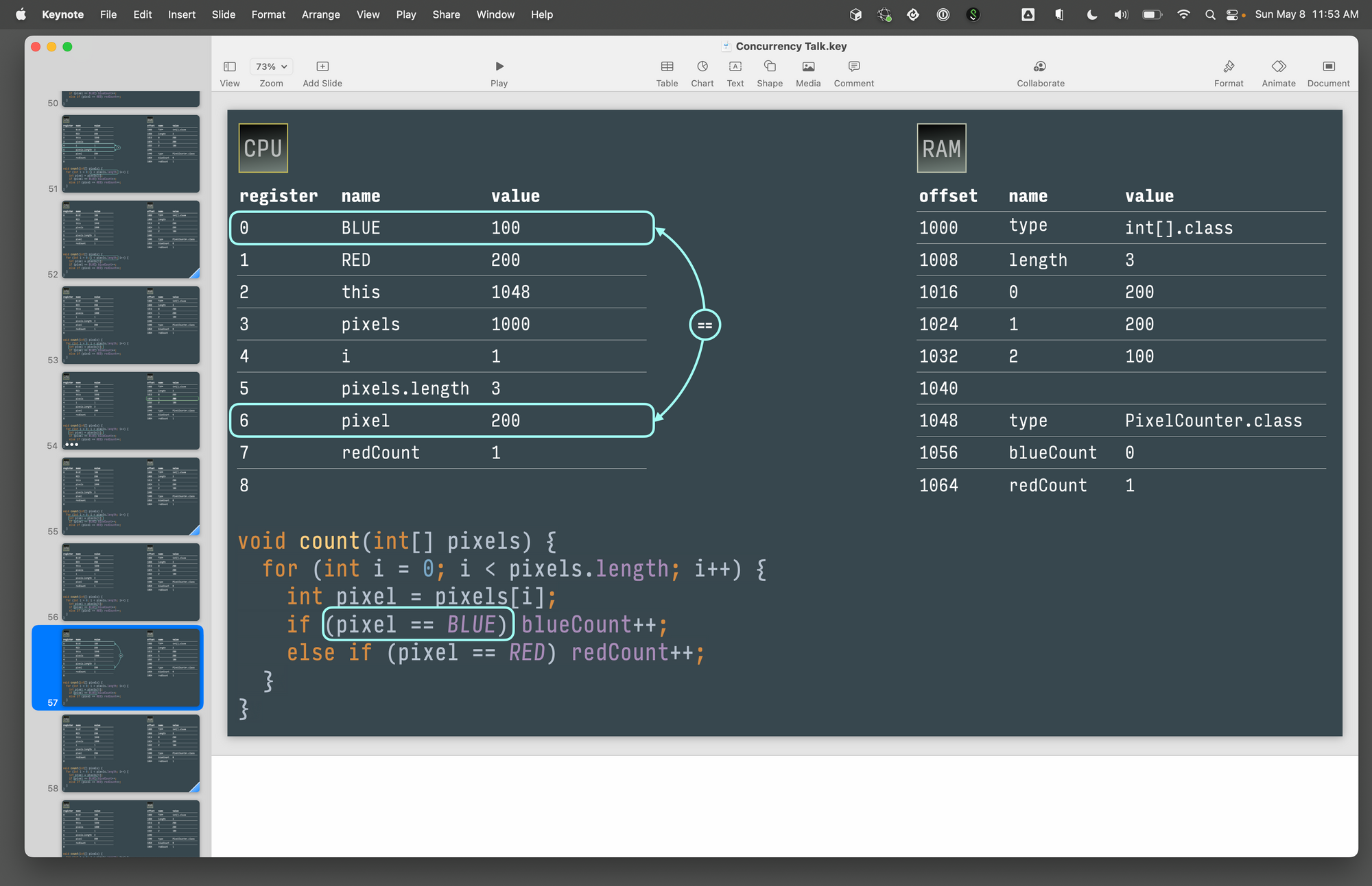
At Chicago Roboto my concurrency talk included an 80-slide build going instruction-by-instruction through a simple loop! That was a lot of work.
Emoji
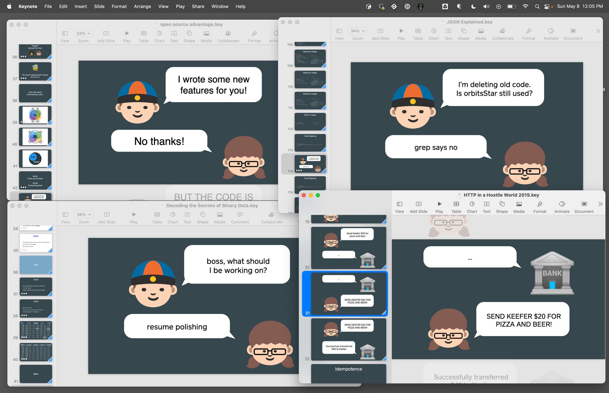
To pay homage to Android I use Noto Emoji in my decks. I can’t just type these into Keynote on my Mac; that yields the iOS emoji. Instead I need to clone the Noto project, import its SVGs into Affinity Designer, then export those as PNGs.
Styled Sections
I borrow slides & techniques from my previous presentations. Changing up the structure from bullets to something else keeps it interesting for the audience and for me.
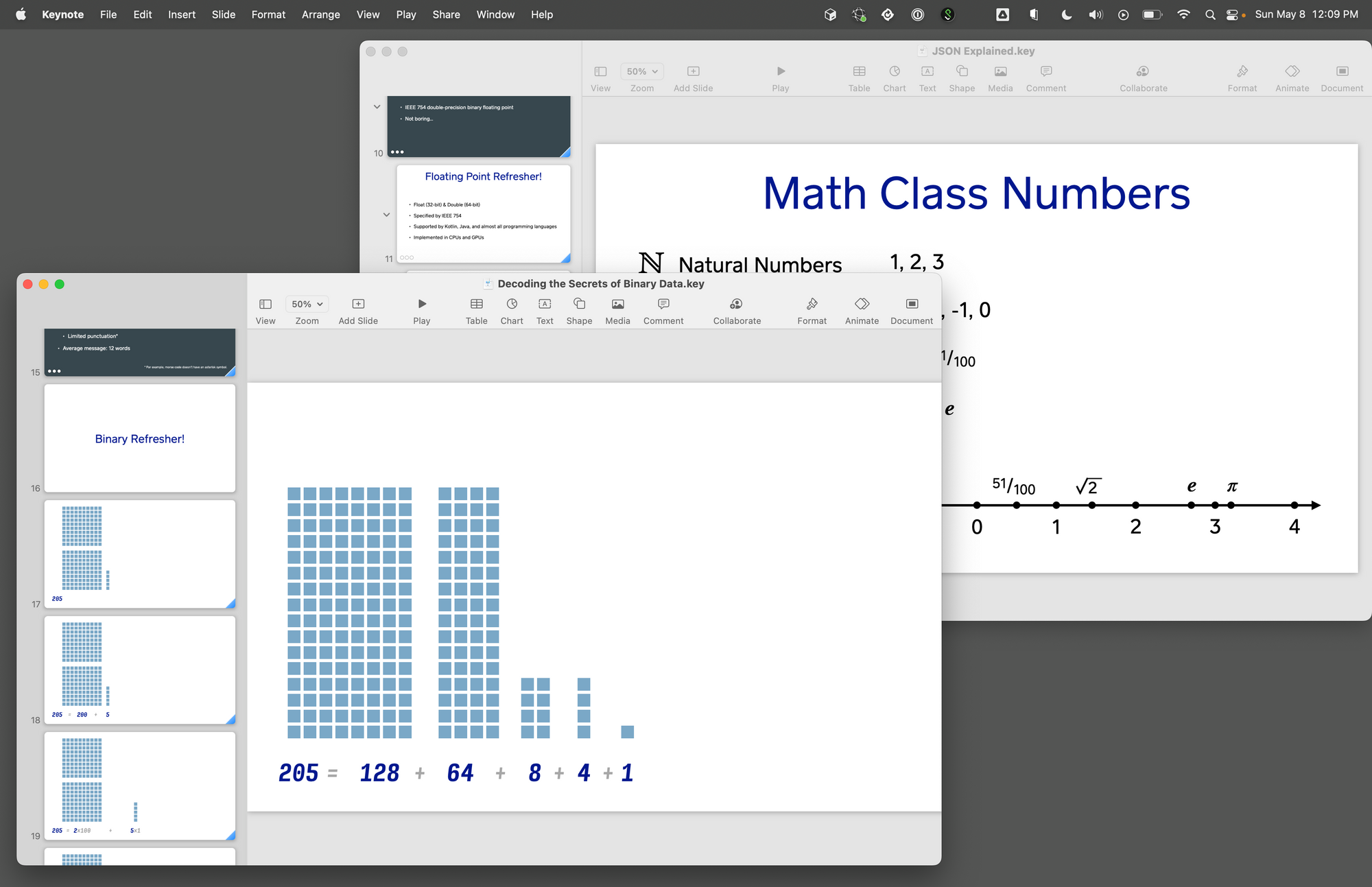
At Droidcon NYC’s my Encoding Talk has a ‘Binary Refresher’ section; and at Roboto my JSON Talk borrowed that technique and visual style with a ‘Floating Point Refresher’. I hope to reuse Nerding Out’s ‘10 Cool Things’ format in a future deck.
Why?
I enjoy the creative process! It gives me an artistic outlet and I genuinely enjoy playing with these tools to make something visual. I can spend an evening of zen arranging stuff in Keynote. The conference and presentation are practically just an excuse to play with slides!
I love the protégé effect: the best way to learn something is to teach it. When I stand on stage and to talk about CPUs or floating point or whatever it’s not because I’ve always been an expert in such things; preparing the presentation gets me to learn the content deeply enough to teach it.
It’s 2022. We’re cautiously coming out of a pandemic and conferences are coming back. If you want to learn something deeply and have fun in the process, present it to others!