Today Google released a revised Roboto. Their design site says,
It is slightly wider and rounder, giving it greater clarity and making it more optimistic.
In Blue, Roboto from Android 4.4 (download .zip)
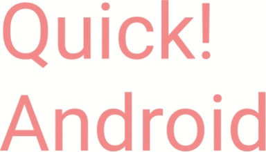
In Red, Roboto from “The L Release” (download .zip)
To my eyes they're quite a bit different. The new Roboto dots its i's and exclamation marks with circles; the old one with squares.